Design challenge · Physical AI
36 autonomous assets.One operator.No surprises after launch.
A search-and-rescue tasking console where the autonomy proposes, the operator decides, and every coverage gap is visible up front.
- Available assets to task in one plan (2 Rocs in maintenance)
- 36Available assets to task in one plan (2 Rocs in maintenance)
- Asset types with different range, endurance and sensors
- 4Asset types with different range, endurance and sensors
- km² of flooded coastal search area
- 1,200km² of flooded coastal search area
Context
This was a design challenge set by an autonomy company.
The brief described a fictional disaster: a Category 4 hurricane made landfall 14 hours earlier near Charleston, South Carolina. Cell towers are down, roads are flooded, and people are stranded on rooftops across a 1,200 km² coastal region.
A two-person team runs the search. The mission operator makes every tasking decision; the supervisor watches the same view and can veto before launch. They work on a large desktop display, often in a dim room, under time pressure.
The fleet is 38 autonomous assets of four types, and they are not interchangeable:
| Asset | Count | Strength | Limit |
|---|---|---|---|
| Roc (fixed-wing) | 6 | Covers large sectors fast | Low detail per pass |
| Hydra (quadrotor) | 24 | Close inspection | 15 km range from a forward staging site |
| Griffin (VTOL) | 4 | Radar and comms relay | Few available |
| Kraken (surface drone) | 4 | Goes where crewed boats can’t | Slow, about 12 knots |
Two Rocs are in maintenance, so 36 are available. Today the operator assigns them one at a time. That takes about 20 minutes and leaves coverage gaps nobody sees until the debrief.
My role: sole designer, responsible for the screens, edge-case states, component library, engineering annotations and the spec for one coded interaction. I worked with Claude through the Figma MCP for file production.
The core problem: the operator has to commit 36 different assets to four sectors in minutes, and trust that the plan actually covers the area before anything moves.
Autonomy can propose the plan, but the operator has to trust it before anything launches.
Objective
The autonomy proposes a full tasking plan, and the operator can verify it, change it and launch it in under five minutes, with nothing launching unseen.
- Coverage at a glance: which sectors are covered, by what, and how well.
- The weakest sector is obvious: the operator can name it without hunting.
- Every autonomy choice is explained in one readable line.
- The operator stays in control: accept the plan whole, change any assignment, or lock assets so a re-propose won’t move them.
- Warnings inform, never block: a HIGH-priority sector below 60% coverage gets an in-place warning, and launch stays available.
- Out of scope: live flight control, route planning (the autonomy owns it), and anything involving weapons or targeting.
Approach
1. A plan can’t be trusted if its own numbers don’t add up
The first draft of the review screen had the right structure, but the data broke it. The counts didn’t reconcile with the fleet. An operator who catches one wrong count stops trusting every other number on the screen.
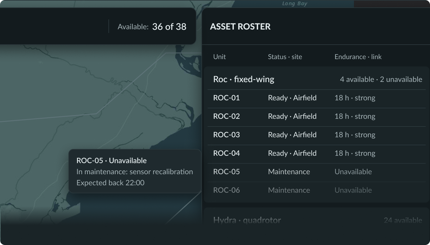
- I rebuilt the roster as a single source: 38 units, each with a real ID, type, sector and status.
- ROC-05 and ROC-06 stay on screen as unavailable, with the reason and when they’re expected back.
- “Zones” became “sectors” to match the brief, lettered A to D.
 — open at full size
2. Plan in groups, fly as individuals
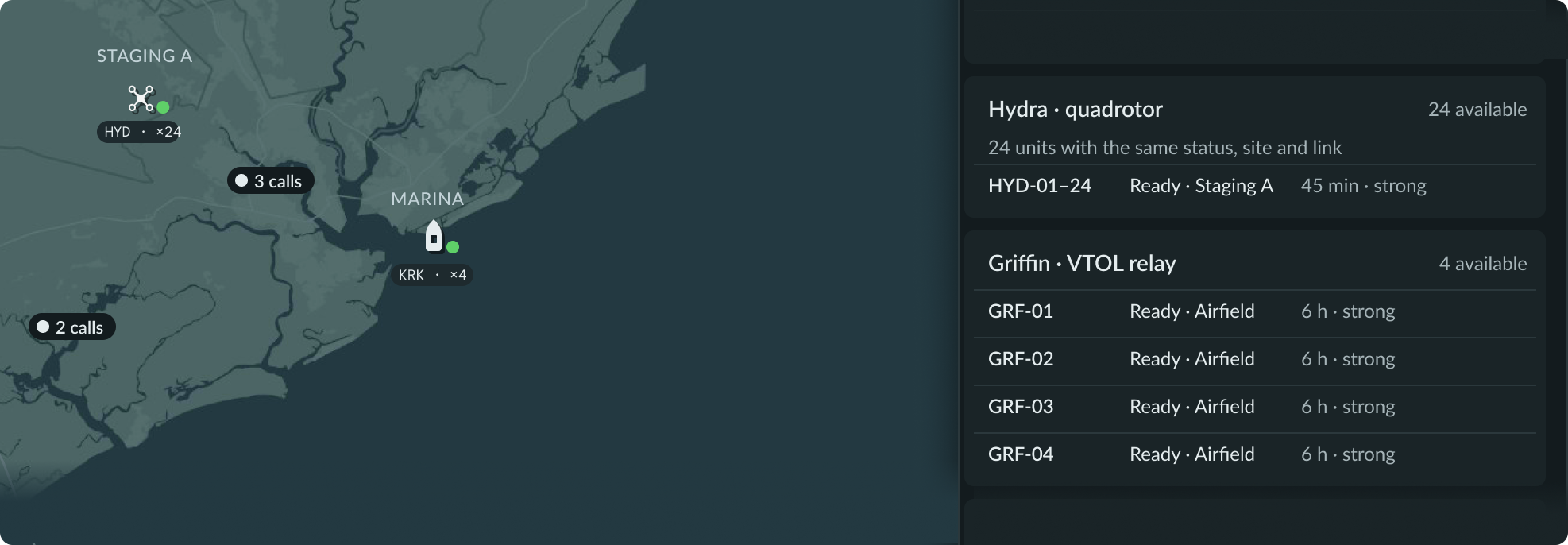
On the review screen the operator is judging a plan, so the map groups assets per sector (HYD ×7). A group of one shows its ID instead of “×1,” which matches the rail and reads as intentional. Selecting a group fans it out into its units, which is where a single Hydra gets dragged to another sector. Individual positions appear only once assets are flying and position matters.
The same logic keeps the roster scannable before a plan exists: 24 Hydras with identical status, site and link collapse into one row, so 38 assets fit in a single view.
 — open at full size
3. Coverage owns the fill, priority owns the chip
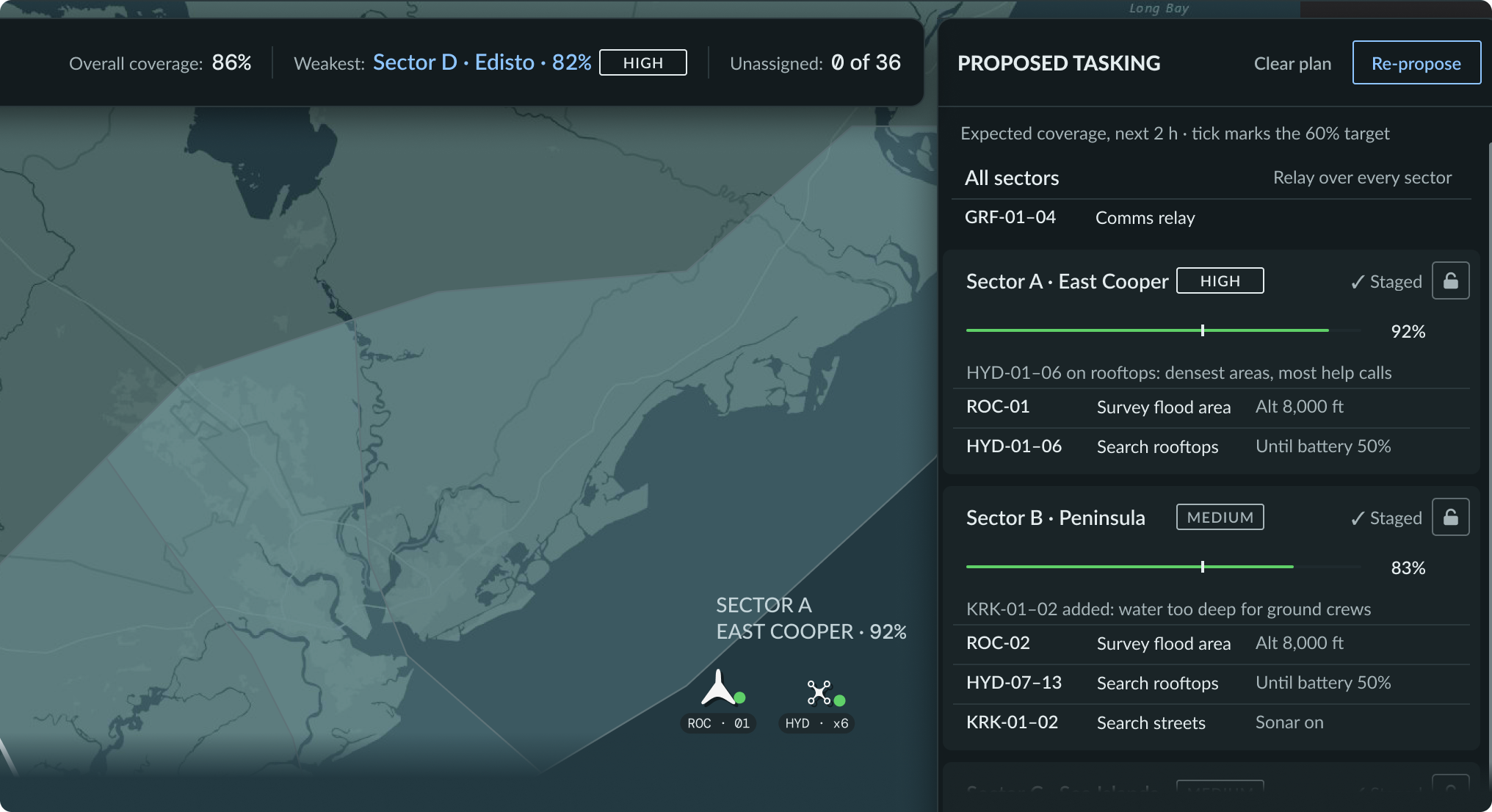
The brief asked how to show sector priority without competing with coverage color. The answer was to give each signal one channel.
- Coverage fills the sector on the map and drives a thin bar on each card, with a tick at the 60% target.
- Priority is a HIGH, MEDIUM or LOW chip beside the sector name, never a color.
- Selection is a white outline, so fill always means coverage.
- Color is earned: amber appears only where the operator should decide, and blue only on things the operator can act on.
 — open at full size
4. Warn with the cost, never block
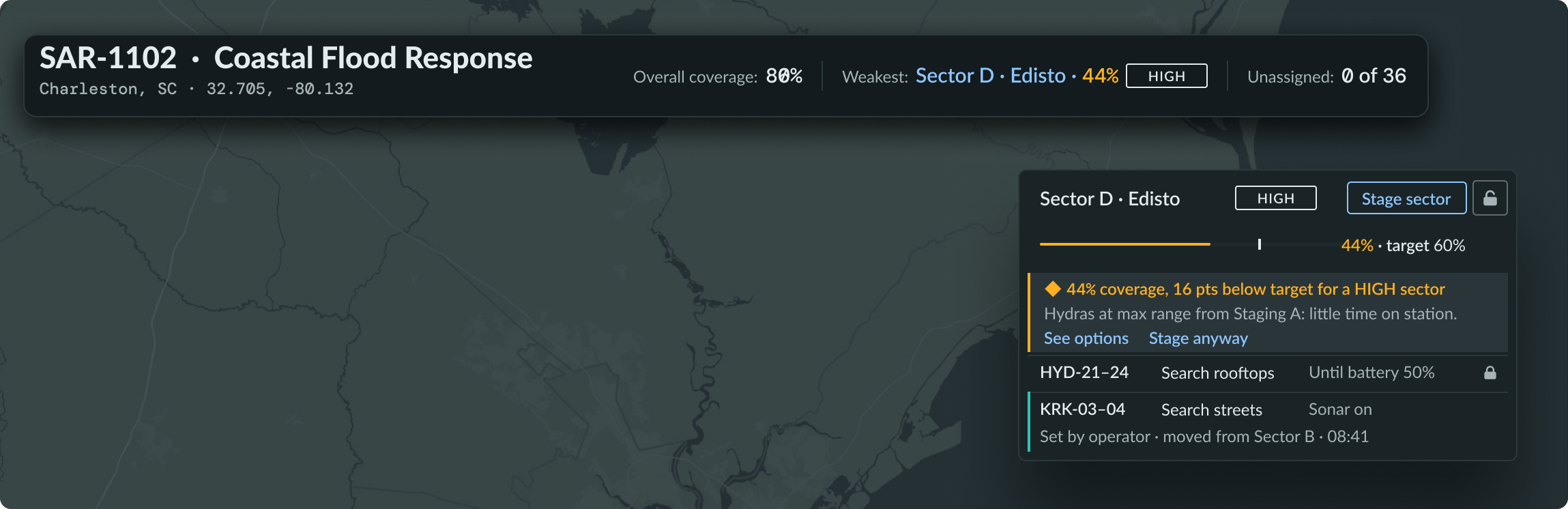
The first Sector D warning named the cause (Hydras at max range from staging) but not what it cost. The rewrite puts the cost first, in the operator’s terms:
◆ 44% coverage, 16 pts below target for a HIGH sector
Hydras at max range from Staging A: little time on station.
See options · Stage anyway
 — open at full size
“Stage anyway” makes the rule visible: the warning informs, and the operator can still stage and launch. A stat bar above the map names the weakest sector, so the operator never has to hunt for it.
5. Mark the exception, not the default
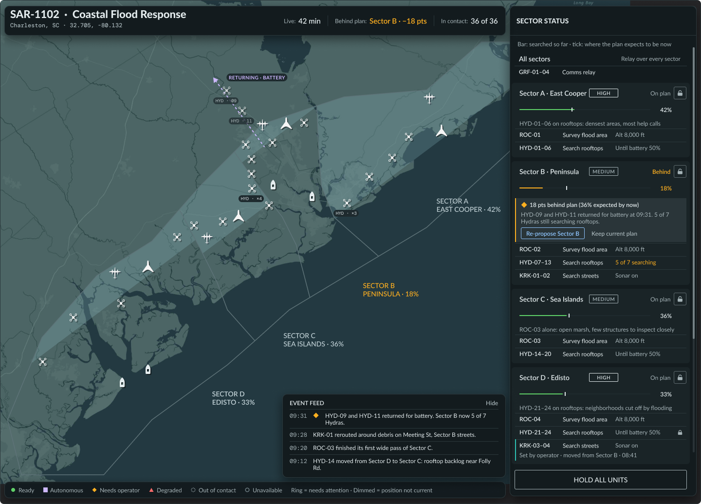
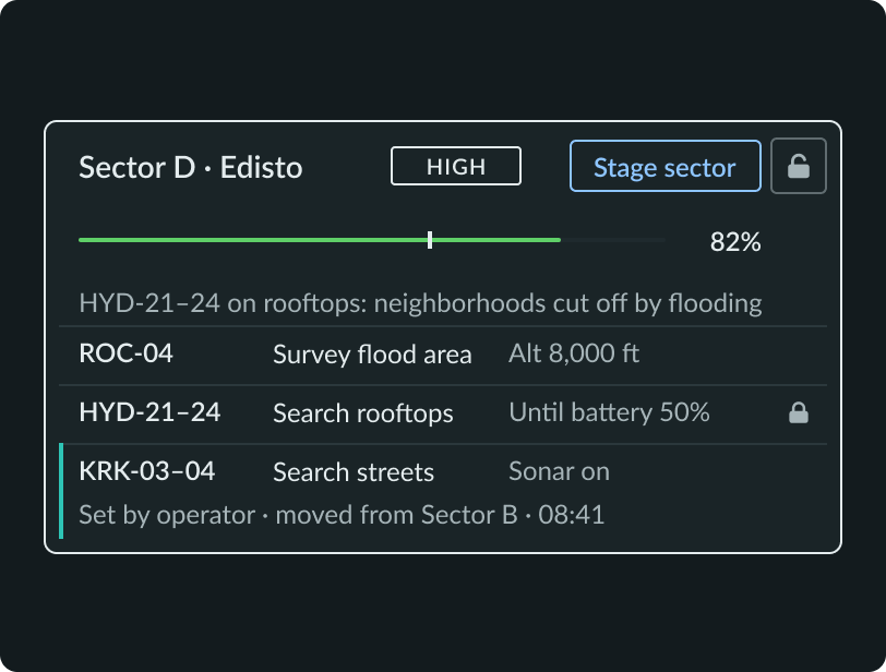
Most of the plan comes from the autonomy, so autonomy rows carry no marker, only their one-line reason (“KRK-01–02 added: water too deep for ground crews”). Operator changes are the exception, so they get the marker:
- A teal left bar and a source line: “Set by operator · moved from Sector B · 08:41.”
- Purple stays reserved for the Autonomous status, so the two never blur.
- The status badge in each row became a lock control, since locking is the action the operator takes there. Locks and priority chips align in fixed columns, so the rail scans in one pass.
6. In this domain, the edge cases are the job
I designed five states, centered on one failure caught before launch and one handled during the mission.
Before launch: a sector the fleet can only partly reach. As soon as the operator draws Sector D, the console flags that Hydras can only partly reach it: most of the sector sits beyond their 15 km limit from Staging A. Selecting the sector shows exactly what can reach it — Roc from the airfield, Kraken from the marina, Griffin relay coverage, and Hydra only along the NE edge. The gap is visible before a plan is even proposed.
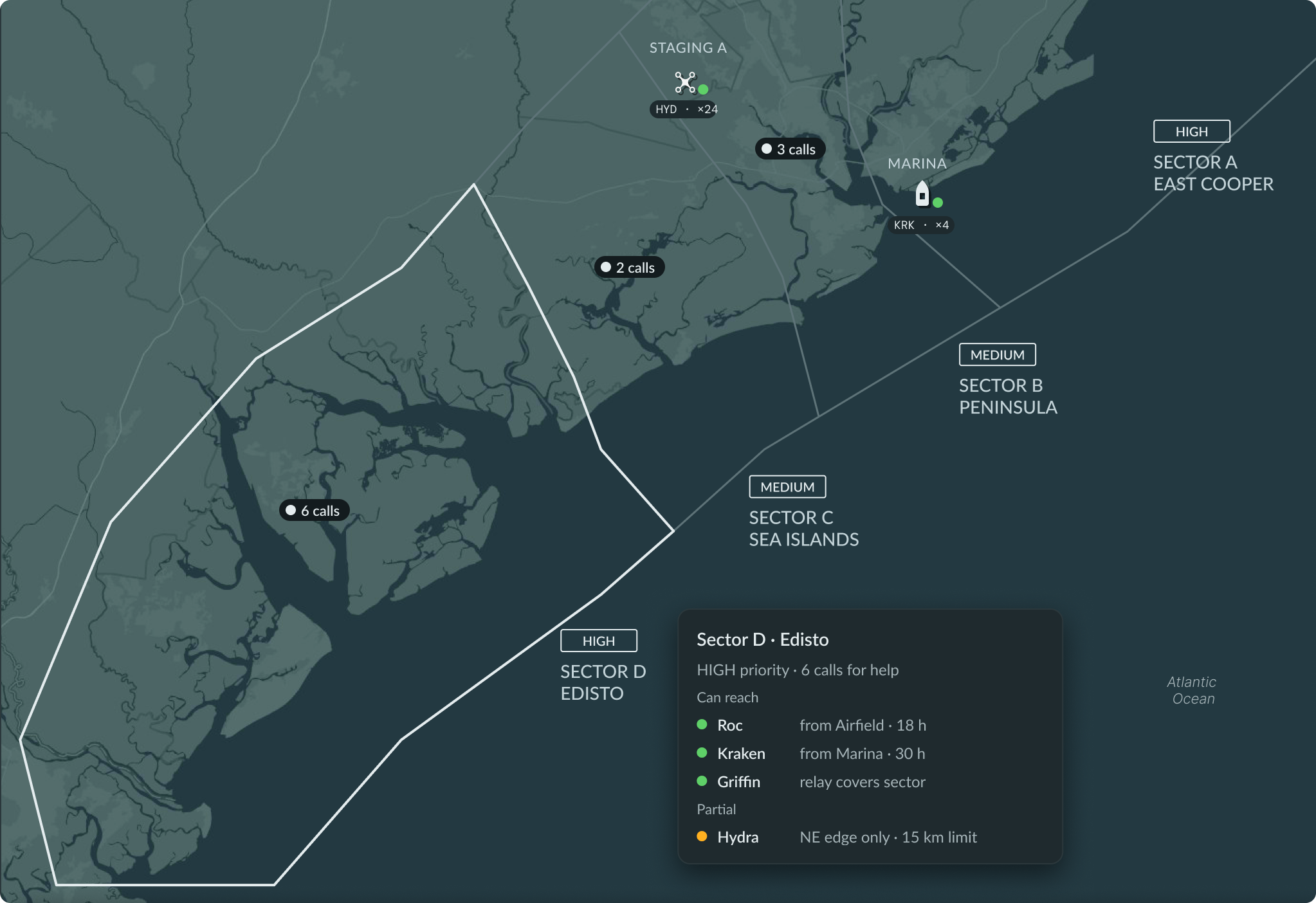 — open at full size
During the mission: a sector falls behind plan. Two Hydras return for battery, and Sector B drops 18 points behind where the plan expected it to be. The card shows planned versus actual coverage, explains why in one line, and offers a choice: Re-propose Sector B or Keep current plan. The autonomy proposes; the operator decides.
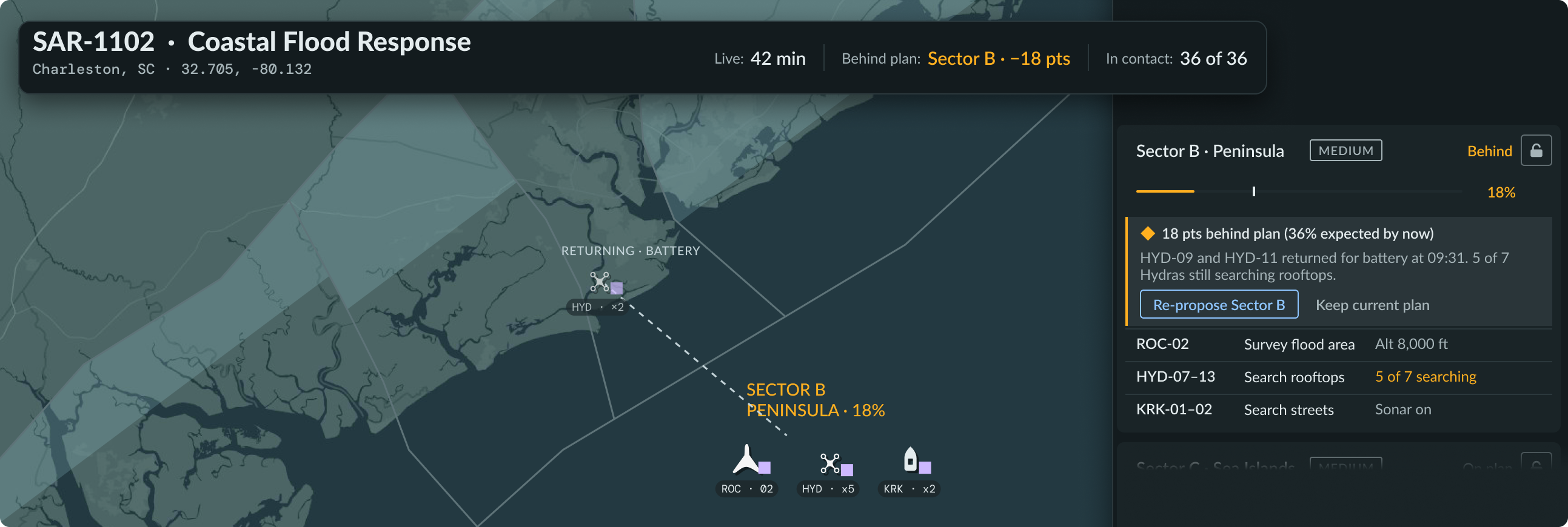 — open at full size
Also built: the empty state (no sectors drawn, so nothing to propose), a HIGH sector below its coverage target, and unavailable assets with the reason and expected return.
What I’d build next: a lost relay link, shown as one incident card with the root cause first; a supervisor veto; and a re-propose that conflicts with a locked asset.
Engineering Handoff
The review screen was the key decision, so its parts became the system: a sector card with 8 variants (staged, selected, low coverage), a tasking row with 4, and priority chip, lock, status and asset-marker components, all bound to 21 color tokens and reused across all three screens.
Each color token carries a USE WHEN / AVOID rule, written so engineers and AI agents apply color the same way the operator reads it.
The brief asked for one coded interaction: drag an asset between sectors, with coverage updating live. I wrote the handoff so the build could not drift from the design:
- One data file: all 38 units and a simple coverage rule, tuned so the default plan reproduces the Figma screens exactly (A 92%, B 83%, C 87%, D 82%, 86% overall).
- Tokens as a table: the 21 Figma color tokens mapped to code, with the visual rules (selection is white, never blue; amber only where the operator decides).
- Two kinds of annotation: note cards beside each frame explain the design reasoning; native Figma annotations sit on the exact layers engineering will build.
- A one-drag acceptance test: moving ROC-04 from Sector D to Sector B should drop D to 44% (B rises to 97%, overall falls from 86% to 80%), show the inline warning, name D as weakest in the stat bar, and mark ROC-04 as set by operator.
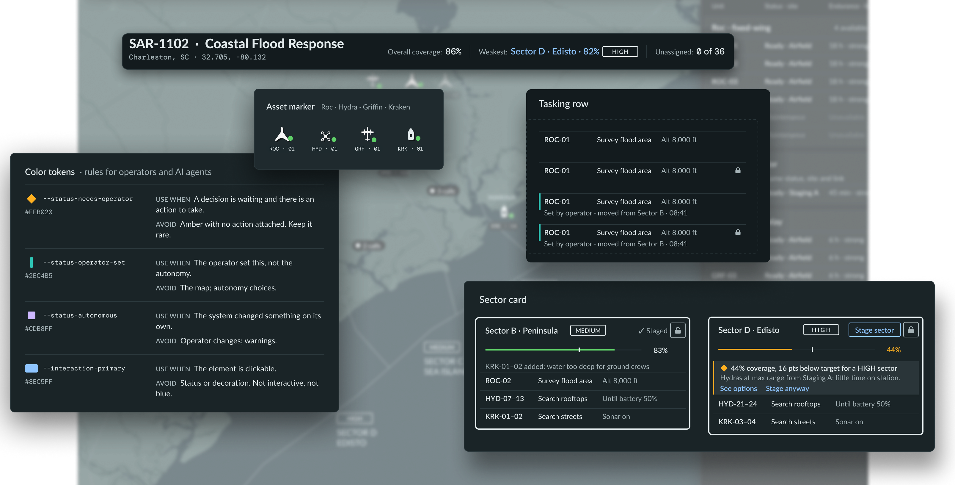 — open at full size
Outcomes & Impact
- Three screens at desktop size, dark theme: Area overview, Review proposed tasking, Tasking live.
- Five edge-case states built, from the empty state through a sector falling behind plan.
- A component library of 8 component sets bound to 21 color tokens.
- A launch summary that lists every unit before launch, so no assignment goes out unseen.
- The brief’s open design questions answered on the canvas: priority versus coverage color, operator versus autonomy choices, warning strength, and a 38-row roster that stays scannable.
- Target minutes to task 36 assets
- <5Target minutes to task 36 assetsDown from about 20 today. A design target from the brief, not yet tested with operators.
- Assets launched with an assignment the operator did not see
- 0Assets launched with an assignment the operator did not seeEnforced by the launch summary.
- Coverage floor for HIGH sectors
- 60%Coverage floor for HIGH sectorsBelow it, an inline warning shows the cost; launch is never blocked.
Reflection
Cohesion came from taking elements away
Early versions looked like three products stitched together. Color and contrast draw the eye to what needs attention. The fastest way to make decisions is to build and get it in front of a few users; from there it’s a matter of refinement.
How I’d validate it
- Time to task: run the review flow with SAR coordinators and measure time from proposal to launch against today’s ~20 minutes. Target: under 5.
- The five-second glance: show the review screen briefly and ask, “Which sector is weakest?” If operators have to hunt, the coverage fill isn’t working.
- Override rate, and why: track how often operators change the autonomy’s assignments. Constant overrides mean they don’t trust the plan; zero overrides might mean they’ve stopped checking. The goal is calibrated trust, not maximum trust.
The open product questions shape the screens
Can the supervisor edit, or only veto? Can the autonomy ever move a locked asset? What counts as good enough to launch? Each answer changes the design, and they’re the first conversations I’d want to have with a product lead.